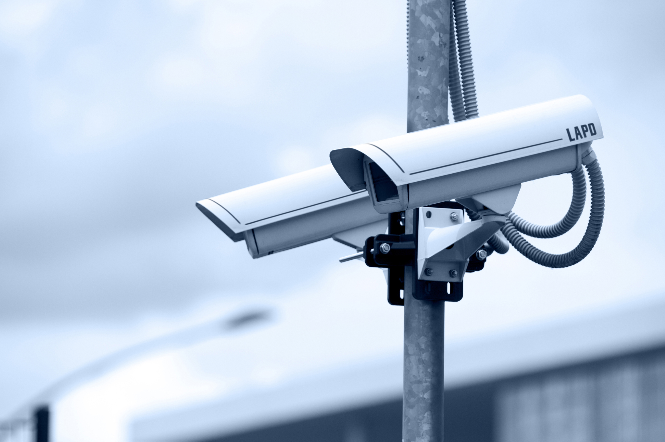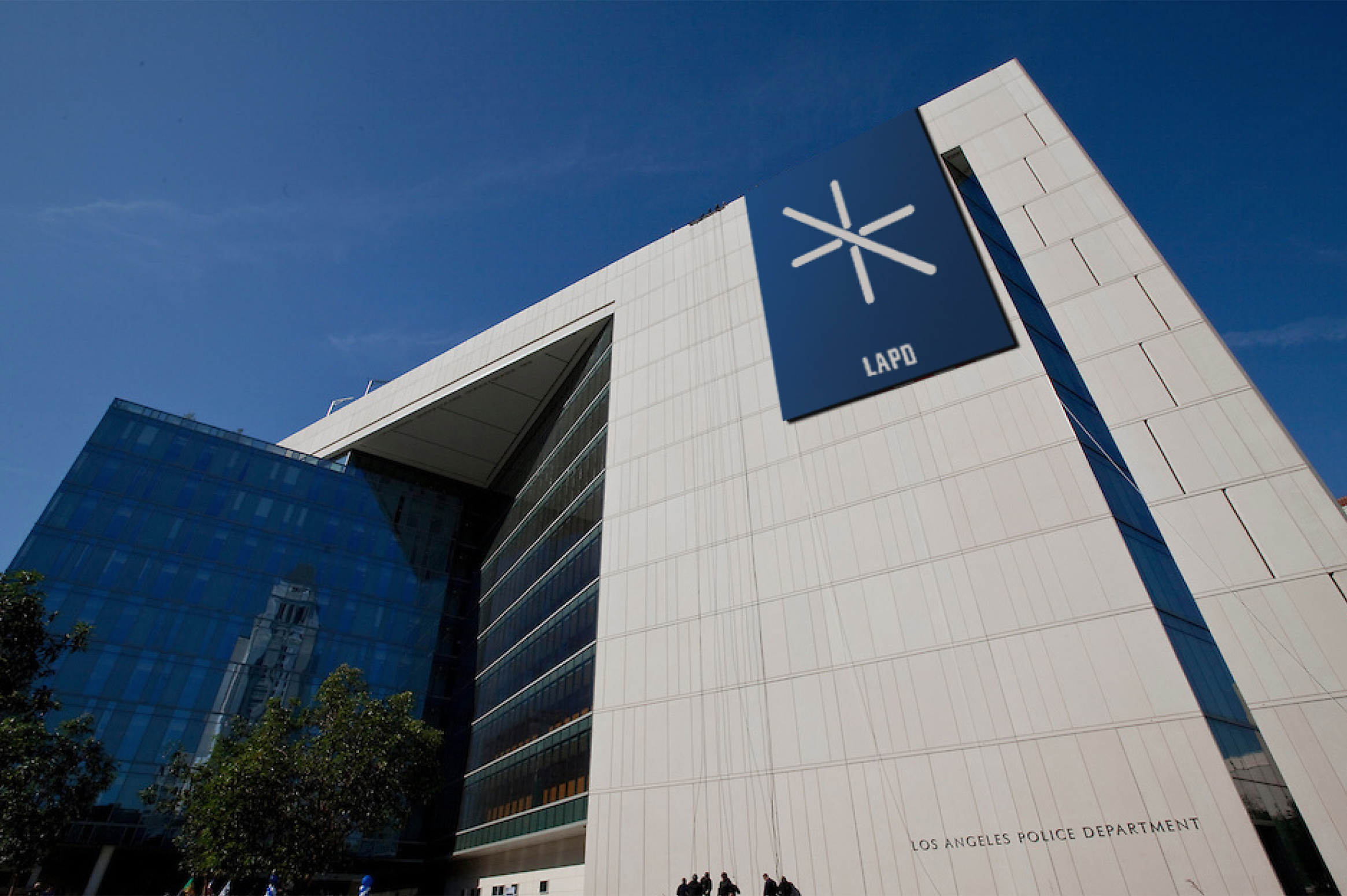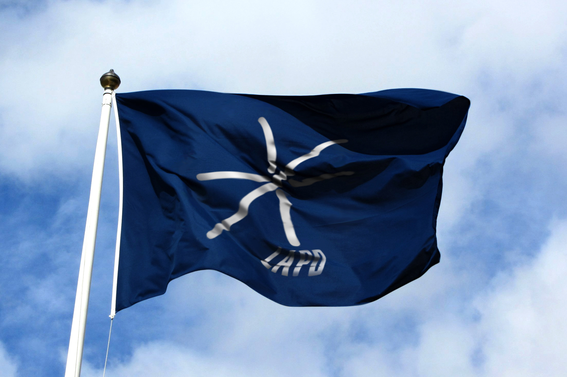
LAPD
Branding
Branding
Project Brief:
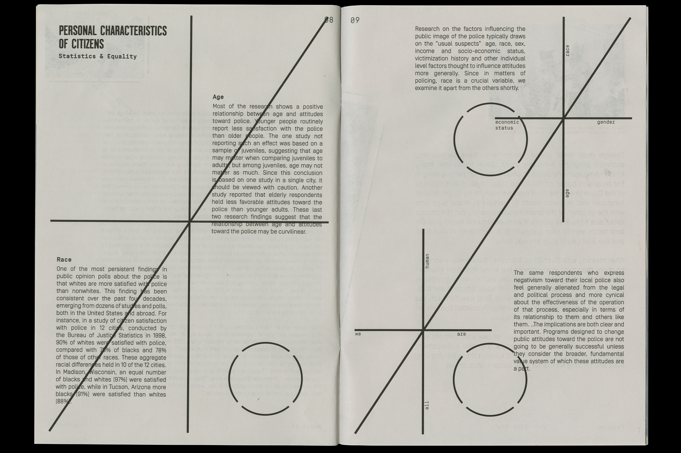
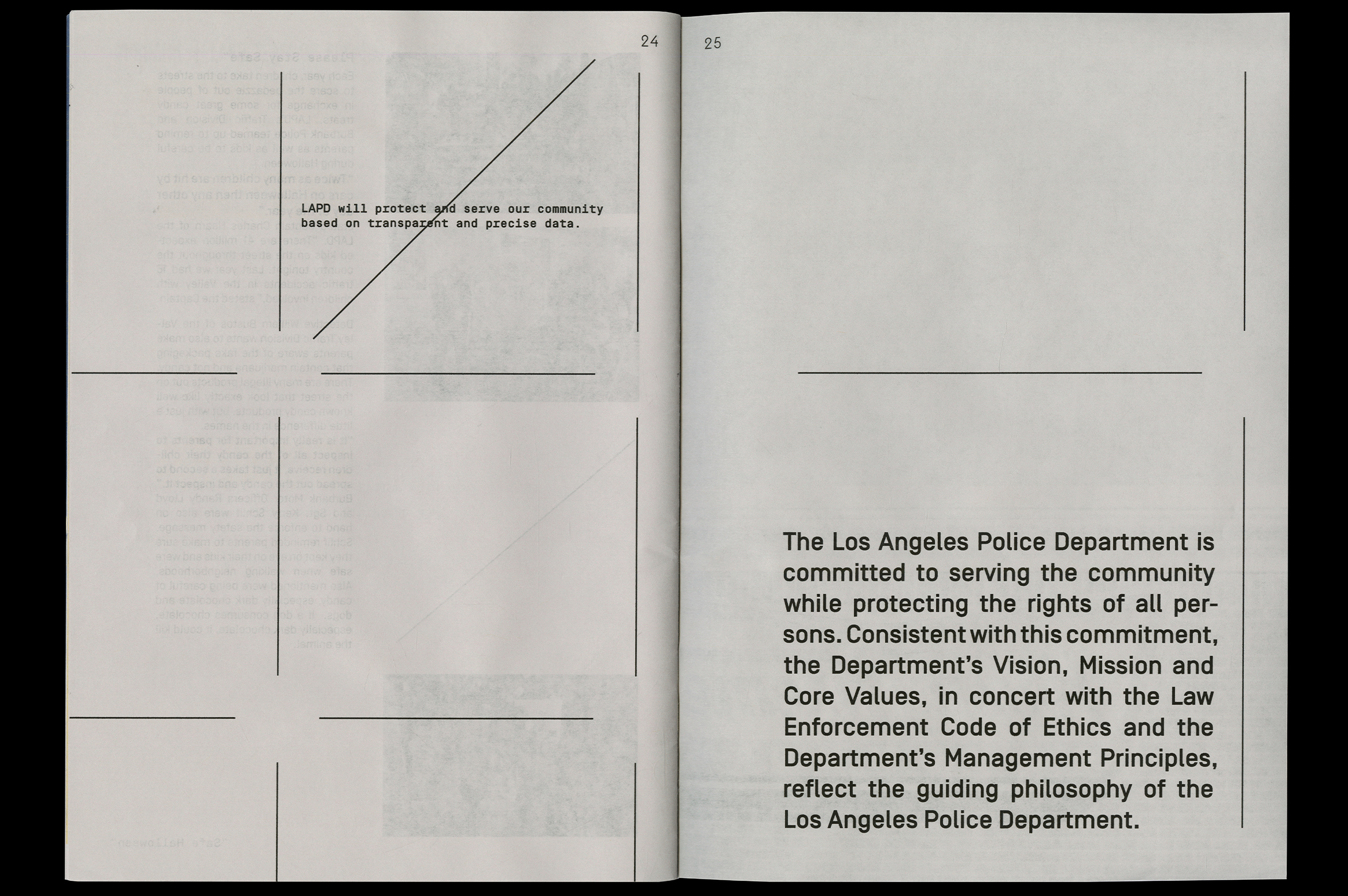
The Los Angeles Police Department is the third-largest municipal police department in the United States. The department has been associated with a number of controversies, mainly concerned with racism, police brutality, and police corruption. The main goal of this redesign is to improve public perception by creating a visual presence that is informative and embraces transparency and community.
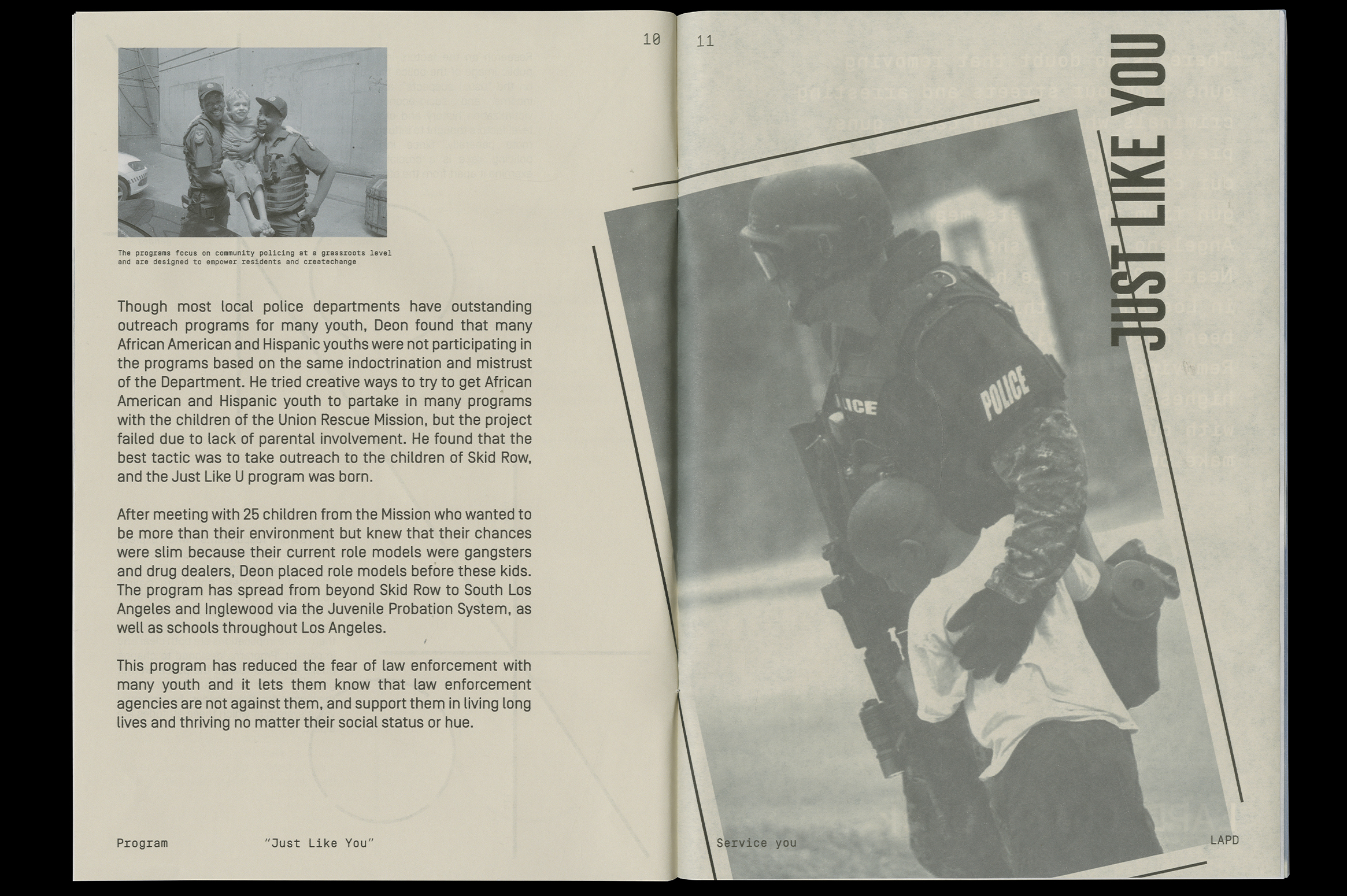
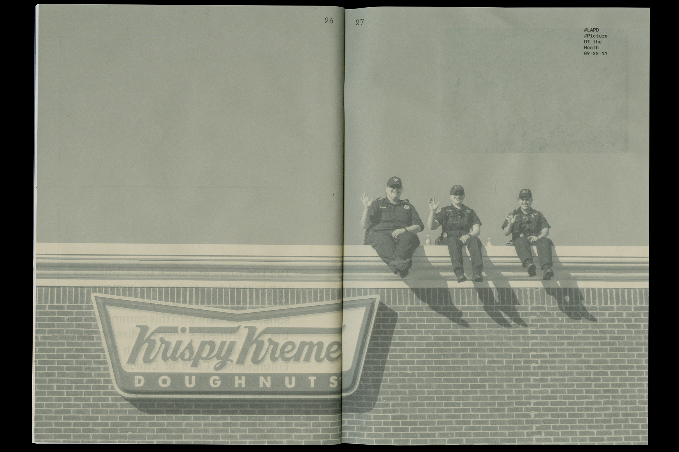
The logo design creates a balance between law enforcement and public safety. The entire system focuses on humanizing the department, to strengthen the relationship between the officers and the community. Business cards take a conversational approach & traffic tickets offer important facts and information regarding laws and safety.
The Los Angeles Police Department is the third-largest municipal police department in the United States. The department has been associated with a number of controversies, mainly concerned with racism, police brutality, and police corruption. The main goal of this redesign is to improve public perception by creating a visual presence that is informative and embraces transparency and community.
The logo design creates a balance between law enforcement and public safety. The entire system focuses on humanizing the department, to strengthen the relationship between the officers and the community. Business cards take a conversational approach & traffic tickets offer important facts and information regarding laws and safety.


Balance Magazine:
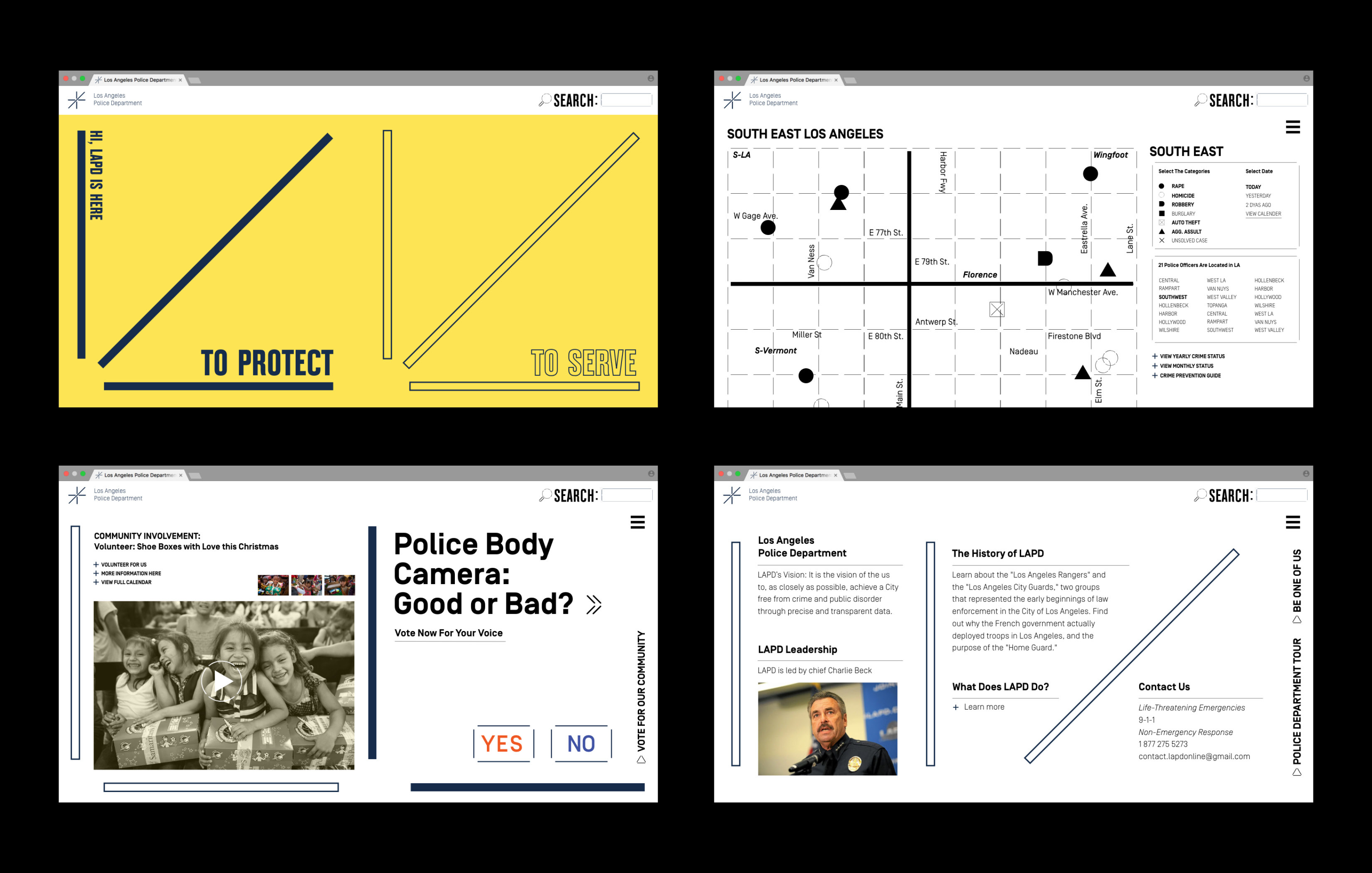
The magazine contains upcoming events, debates, and social issues from the perspective of officers and citizens to reinforce communication and awareness.

Police Box:
Inspired by Kōban, small neighborhood police station found in Japan, building helping booths in neighborhoods and downtown in Los Angeles would help reduce in crimes and be more approachable for the citizens and travelers.
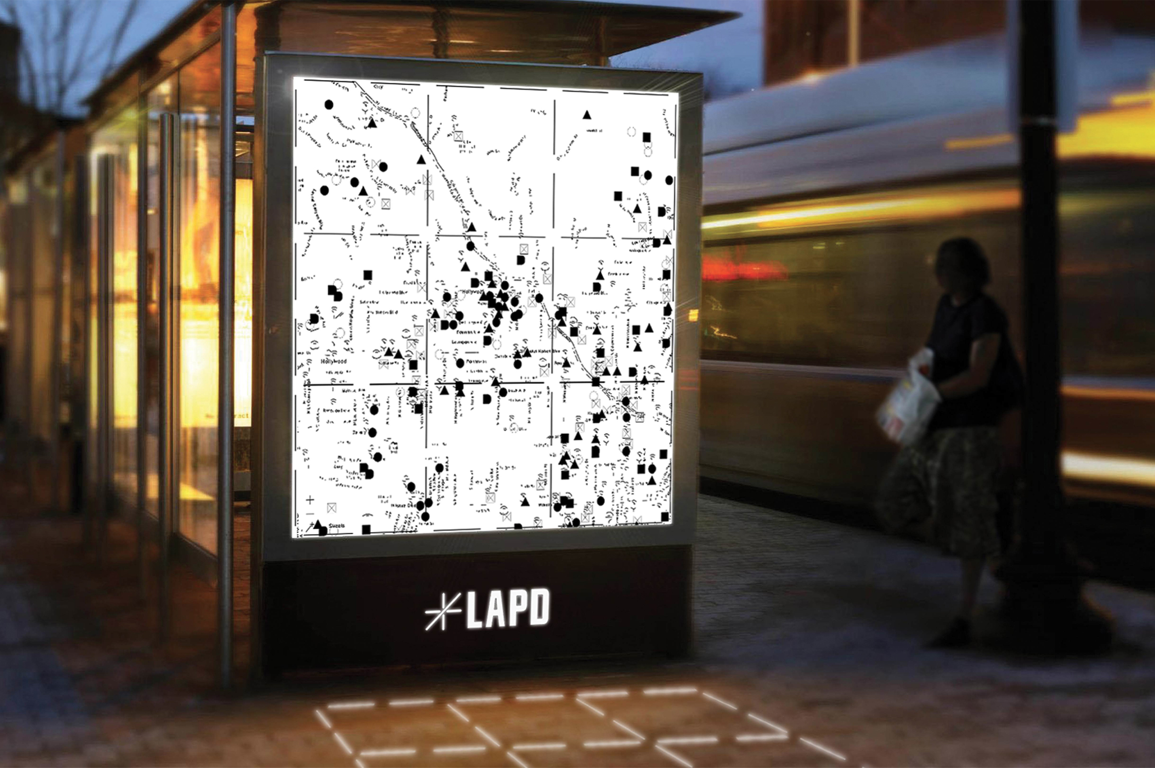

Transmedia:
Step onto dashed boxes designated to different areas of Los Angeles and see LAPD’s activities live.