Canon Inc.
Brand Identity
Brand Identity
Project Brief:
Canon is one of the most beloved camera brands known for its reliability and intuitiveness. The redesign of the Canon identity embraces the physical experience of a person taking a photograph. The moment is precise and dynamic, requiring perfect timing and decision making.
Canon is one of the most beloved camera brands known for its reliability and intuitiveness. The redesign of the Canon identity embraces the physical experience of a person taking a photograph. The moment is precise and dynamic, requiring perfect timing and decision making.
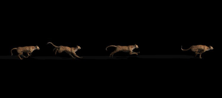
Logo Inspiration:
Acceleration was visualized from a running cheetah, taken with a high speed camera.
Logo Mark:
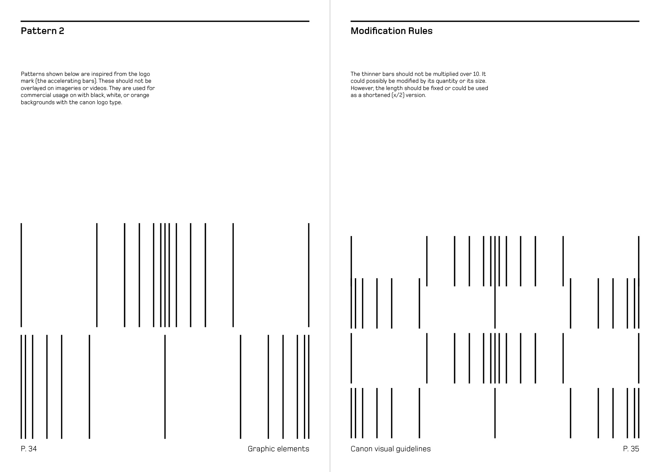
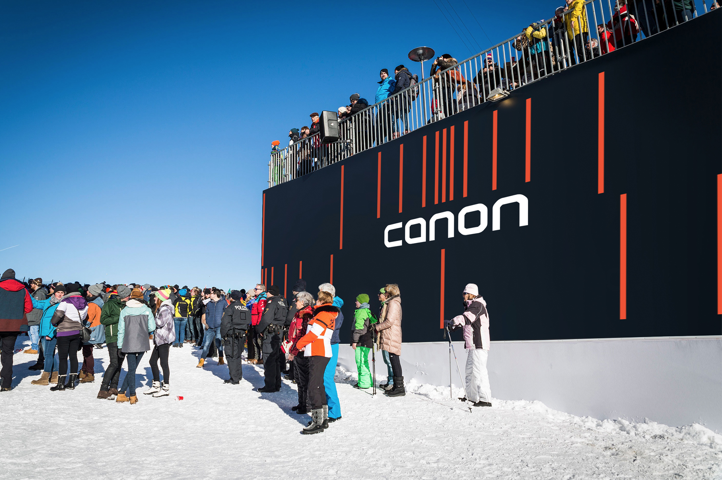
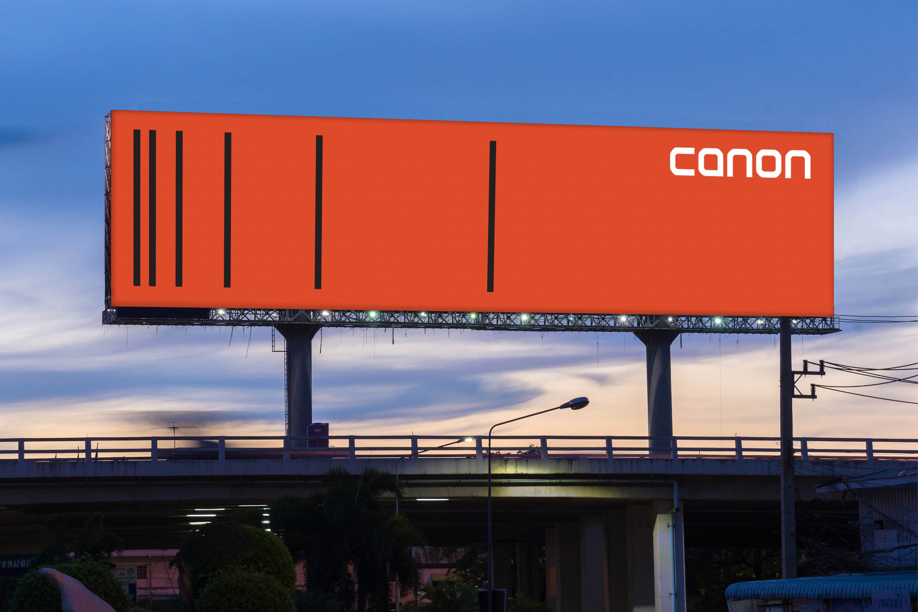
The series of accelerating bars represent progression, engineering, aperture control, precision, archiving and distance. The animated logo form is responsive and fluid. The photographic imagery within the new identity also reflect these sensibilities.
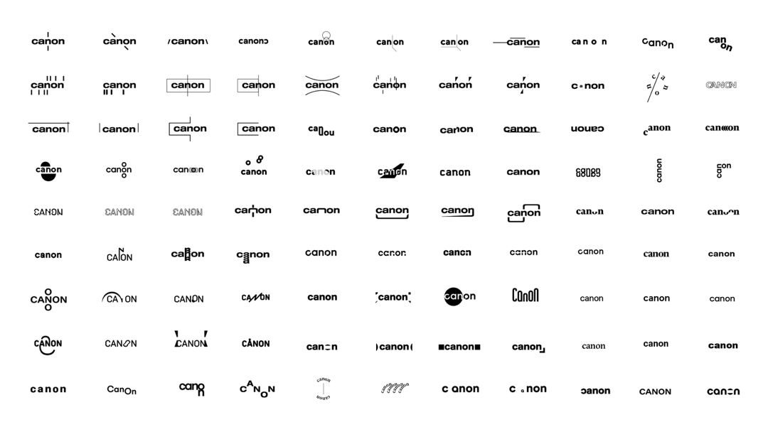
Logo Type:
Within the same frame, people capture their own special moments that are all different. Each type being inside the consistant sized frame is the same idea.
Film:
Watchtower of Turkey
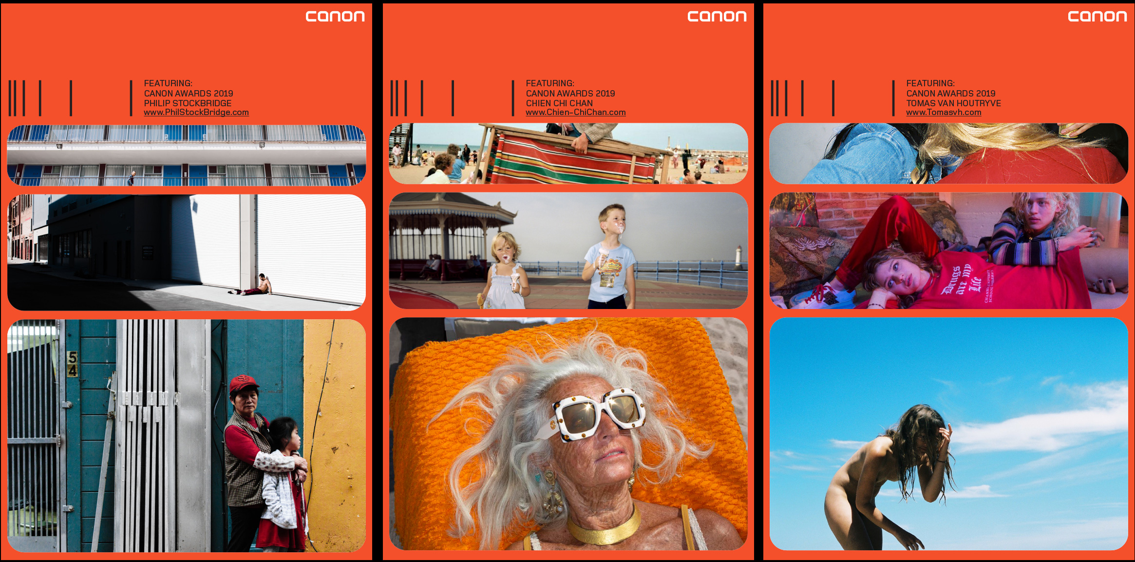


Image Treatment:
The style and treatment is confident with dynamic angles and zooms. The candid moments of culture & lifestyle are raw and honest, making the brand relatable to a wide audience.


Brand Guidelines:
Content:
Introduction / Logo mark & type / Primary typeface / Color usage / Design elements / Photo & video treatment
Introduction / Logo mark & type / Primary typeface / Color usage / Design elements / Photo & video treatment


Scrope of Process