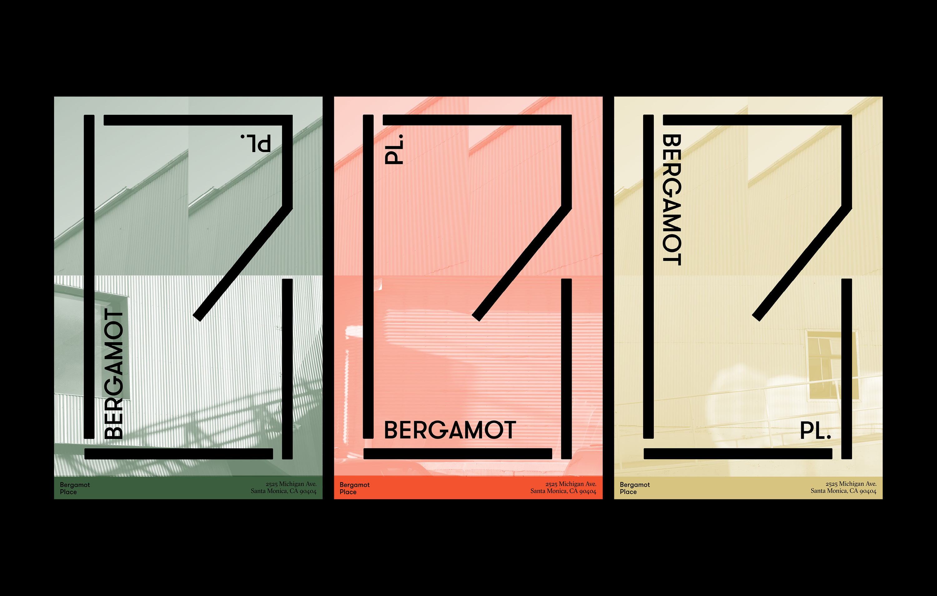
Bergamot Place
Identity System
Identity System
Project Brief:
Over the years, Bergamot Station has become more than a station. It is a place of gathering, where artists and designers to freely interact with one another. Changing the name to Bergamot Place reflects this evolution and inspires a feeling of community.
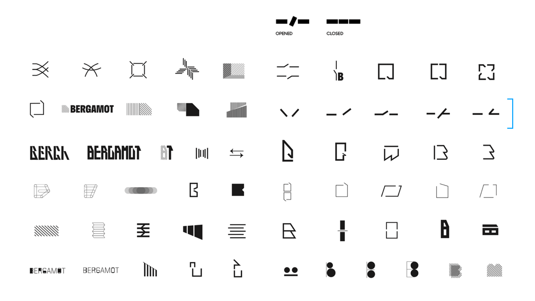
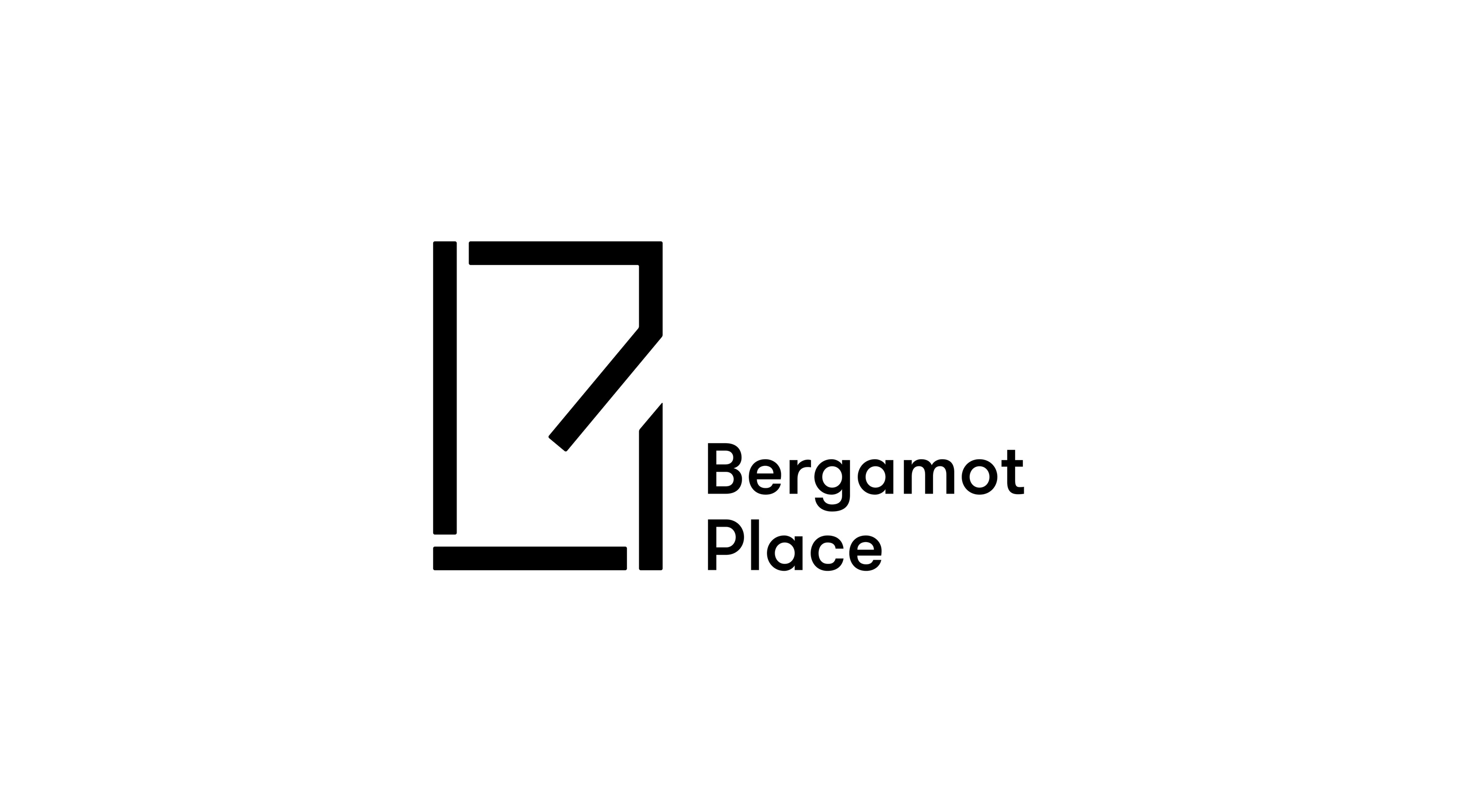
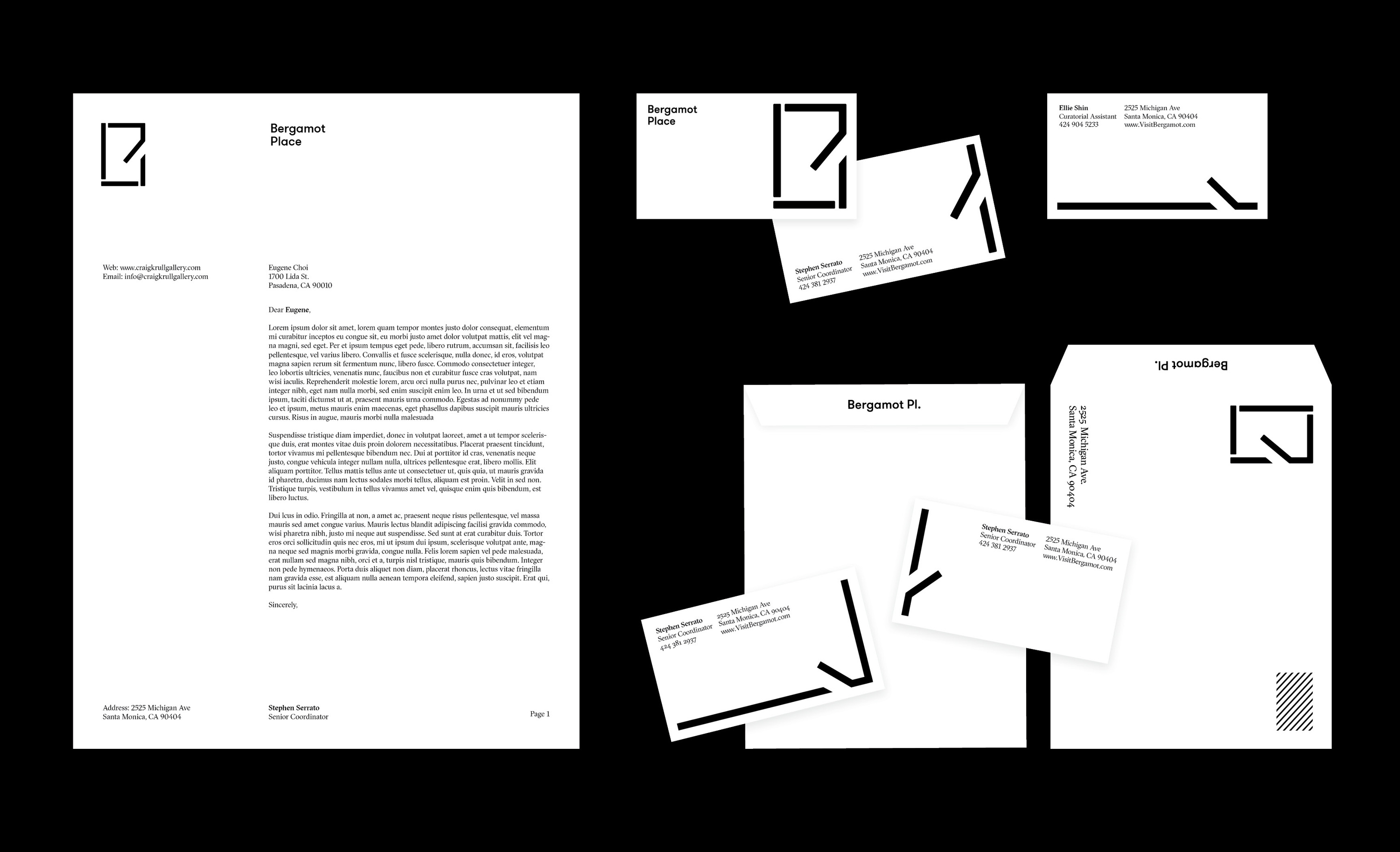
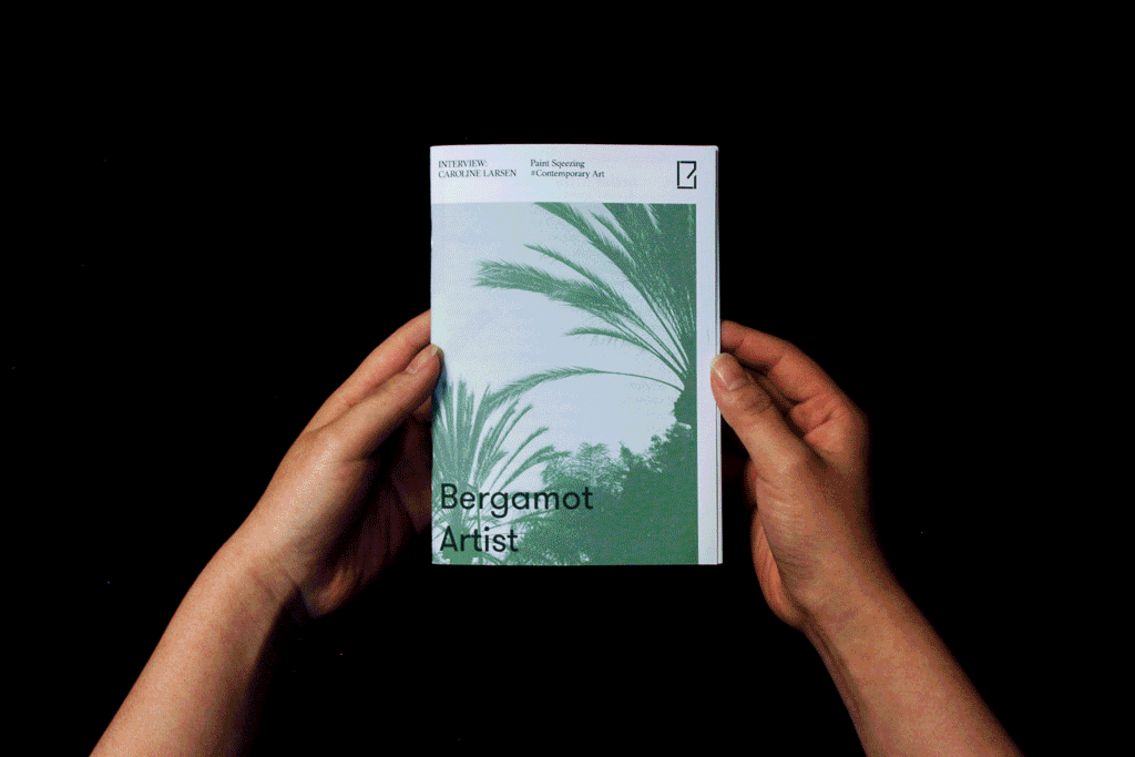
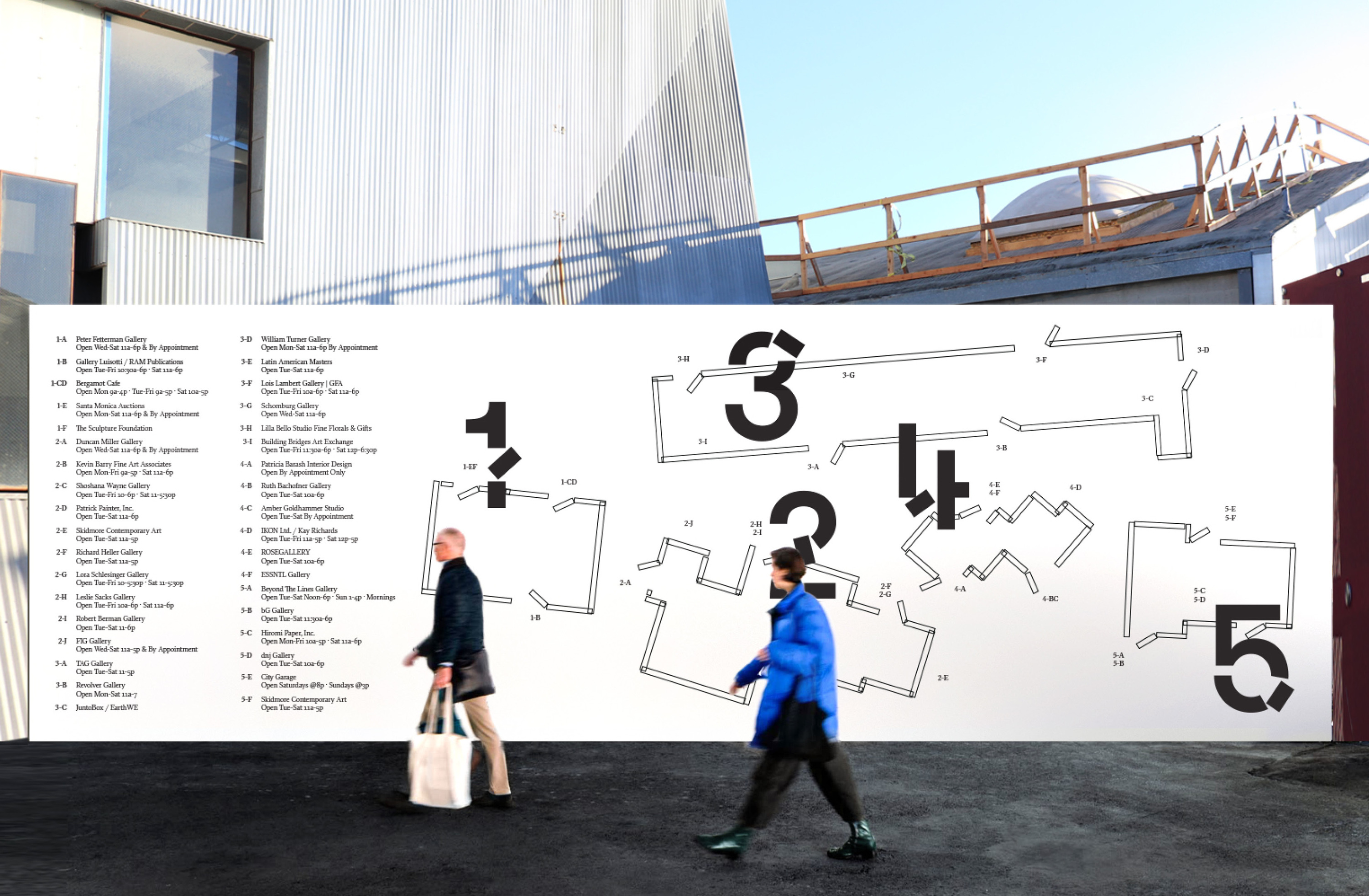
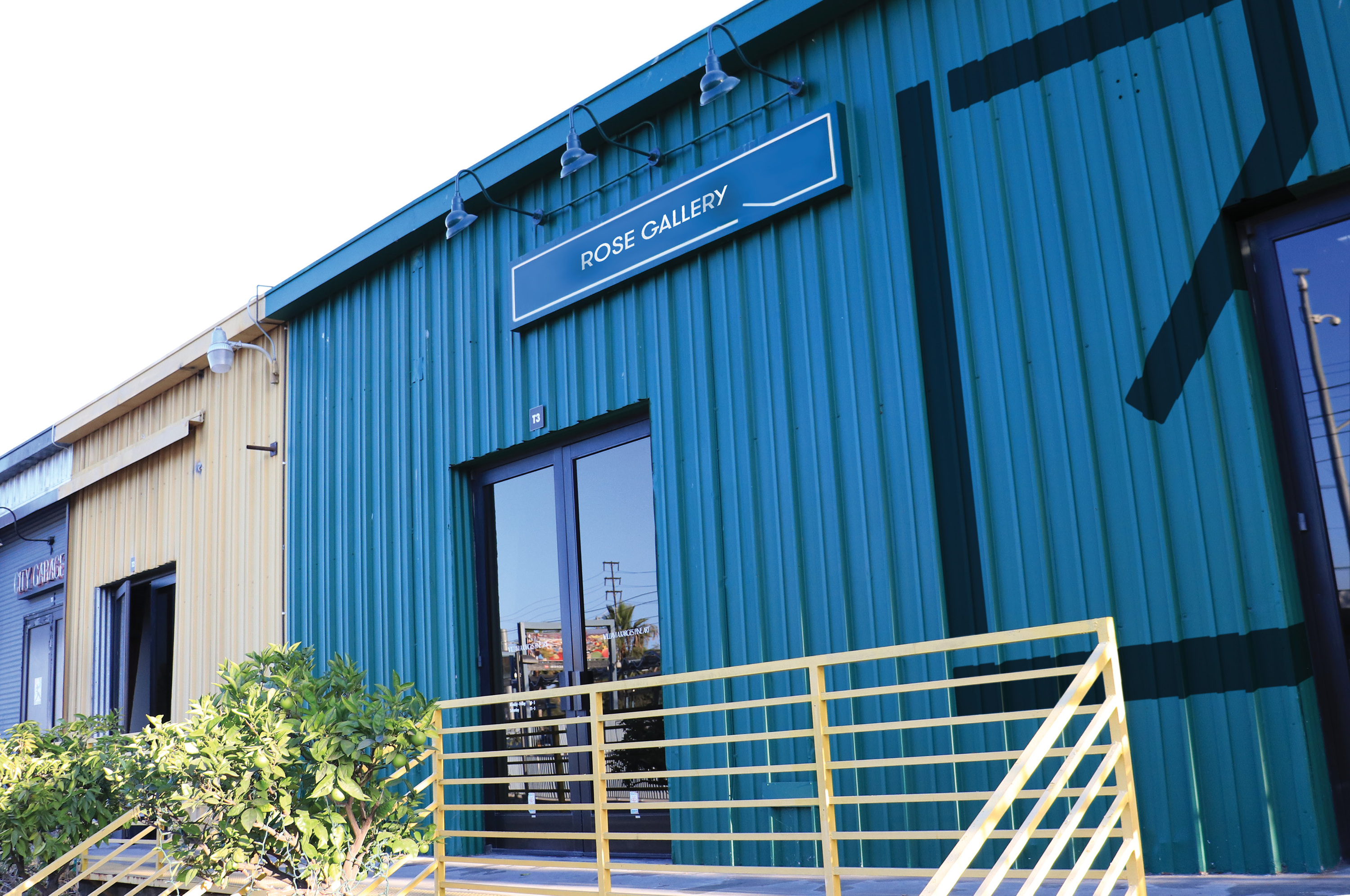
The logo is inspired by a blueprint (spatial plan view) of a space. The modular negative space of the logo mark implies an accessible, open-minded and flexible space. This concept is carried over throughout the entire identity system providing unification for all forty-seven individual galleries.A redesigned wayfinding system provides convince and clarity for visitors. A strong influence of train car textures through the use of diagonal lines and patterns, reflects a history that is not lost.
Over the years, Bergamot Station has become more than a station. It is a place of gathering, where artists and designers to freely interact with one another. Changing the name to Bergamot Place reflects this evolution and inspires a feeling of community.
The logo is inspired by a blueprint (spatial plan view) of a space. The modular negative space of the logo mark implies an accessible, open-minded and flexible space. This concept is carried over throughout the entire identity system providing unification for all forty-seven individual galleries.A redesigned wayfinding system provides convince and clarity for visitors. A strong influence of train car textures through the use of diagonal lines and patterns, reflects a history that is not lost.


Concrete Painting
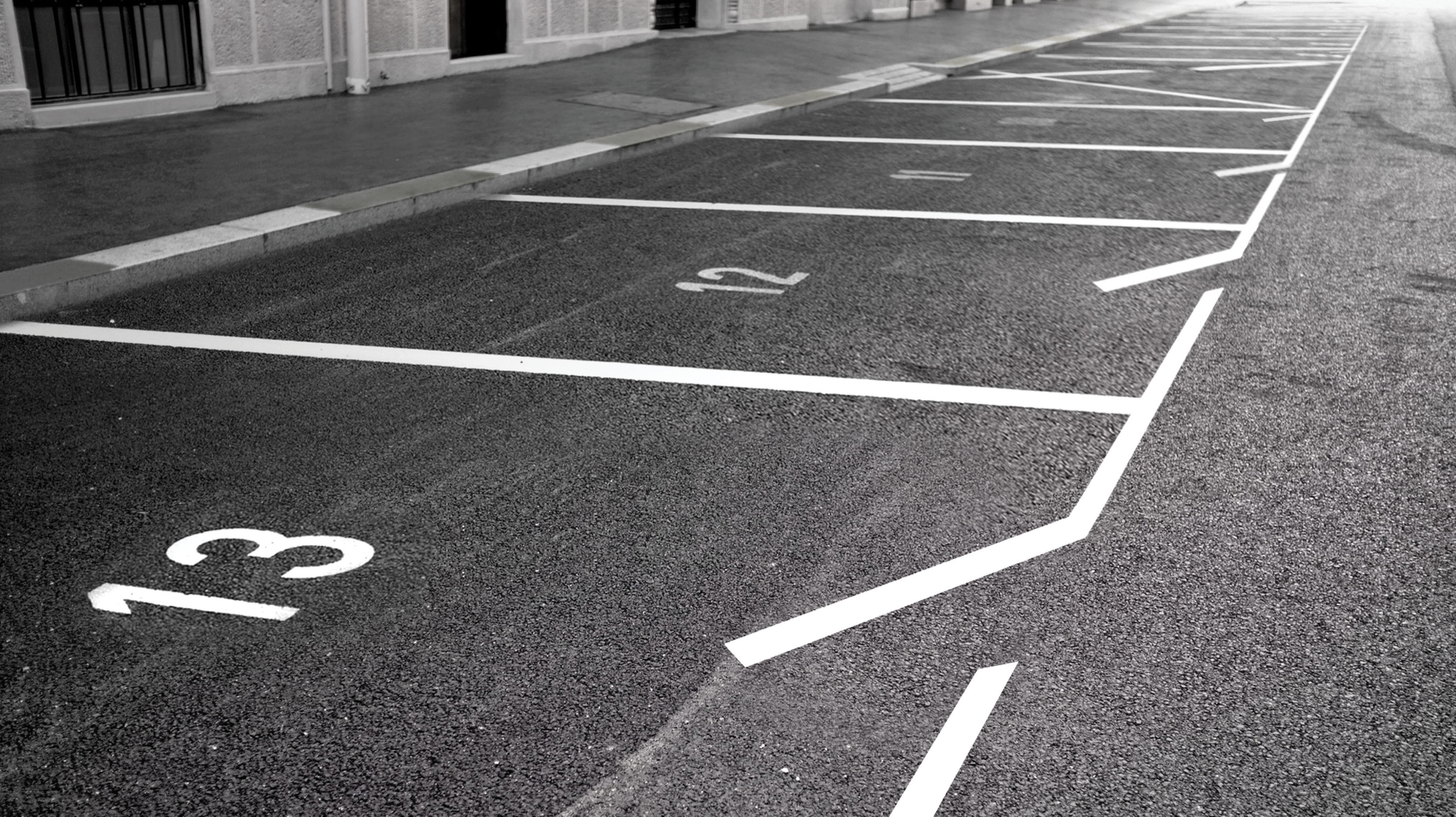
A better way finding system is one of the key purpose of this project. Painting on the concrete floor was a time and money efficient, yet eye-catching way to solve the problem.

Pattern
The diagonal pattern in the poster series were inspired by the metal container texture from the iconic gallery buildings’ texture at Bergamot Place.
Scope of Process
![]()